Budget Friendly Wall Decor Ideas That Look Expensive (But Aren't)
The secret isn't money — it's curation. Four budget tiers, from $0 to one smart splurge, that make any wall look designer-styled.
 By Malik Ashraf · 11 min read
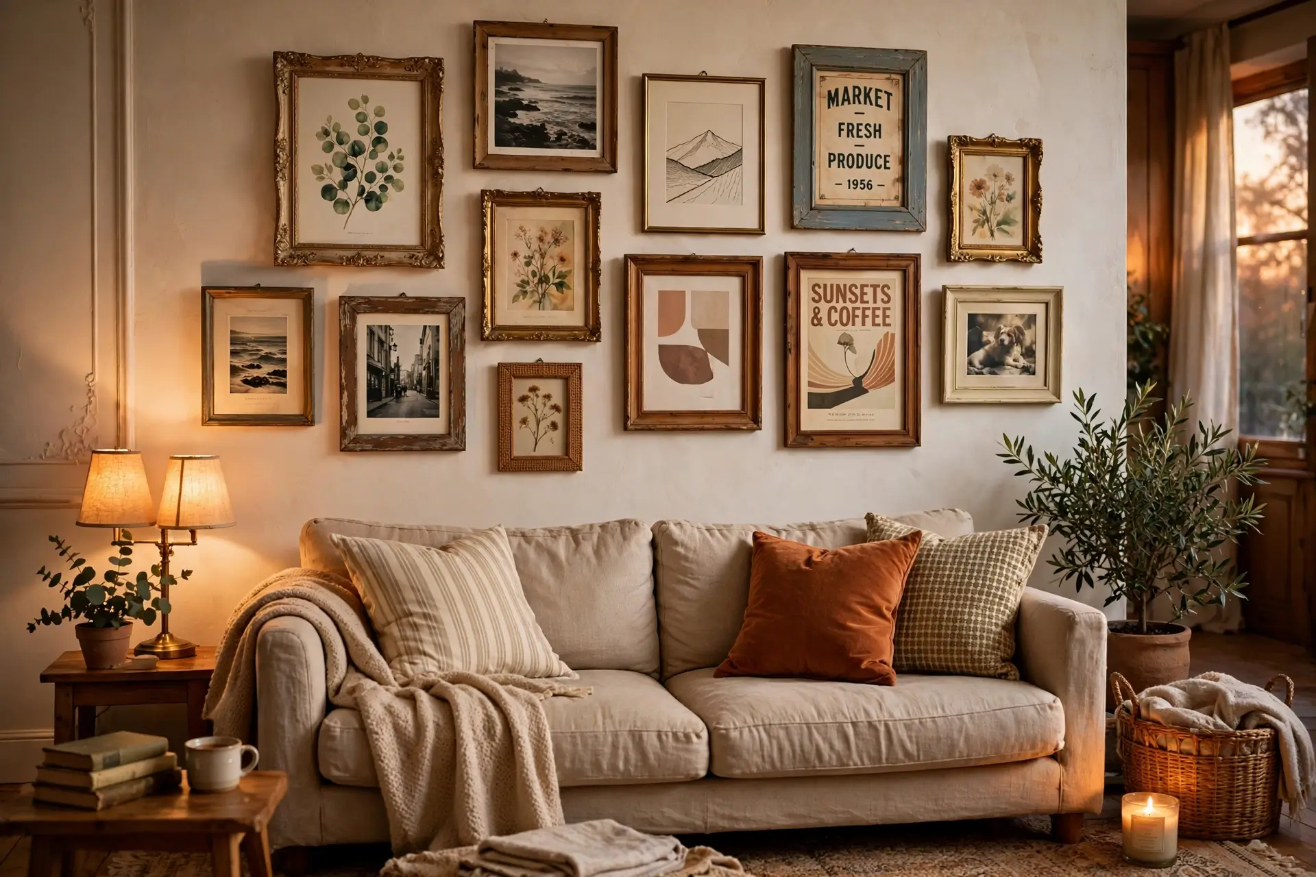 💰 $0 → SMART SPLURGE
Walk into a room with a stunning wall and ask what it cost — the answer is almost never what you'd guess. Expensive-looking walls aren't about expensive art. They're about decisions: pieces that relate to each other, hung with intention, at the right scale. A $15 thrift-store frame hung perfectly beats a $300 print hung carelessly, every single time, without exception. This article is a ladder — four rungs from completely free to one smart splurge — and you can stop at whatever rung fits your wallet. Every rung looks intentional, because intention is free — and it's the only thing guests actually notice.
Before the ladder, the golden rule that makes all of it work: cohesion beats cost. Ten random cheap frames look cheap. Ten cheap frames in the same color, or the same subject, look curated — and curation is what the eye reads as expensive. Interior designers charge thousands for what is essentially this skill: making choices that relate to each other. A limited palette, consistent spacing, repeated shapes — these cost nothing and signal intention. Keep that rule in your pocket; every rung below uses it. For bigger wall projects, our wall ideas collection has more to explore.
Why "Expensive-Looking" Is a Skill, Not a Budget
Here's the uncomfortable truth about decor: most people can't tell a $30 print from a $300 one once it's framed and hung well. What the eye actually reads as "expensive" is a short list — generous scale, confident spacing, a limited palette, good lighting, and clean presentation (straight hangs, no visible hardware mess). Every item on that list is free except scale, and scale can be faked with grouping. That's why budget walls fail: not because the art was cheap, but because it was hung small, high, crooked, or scattered. Fix the presentation and the price becomes invisible. This article is really about presentation disguised as shopping advice.
The $0 Gallery — your photos, nature finds & printables
The Thrift Flip — mismatched frames, one can of paint
The One Big Move — a single statement piece
The DIY Canvas — paint it yourself, proudly
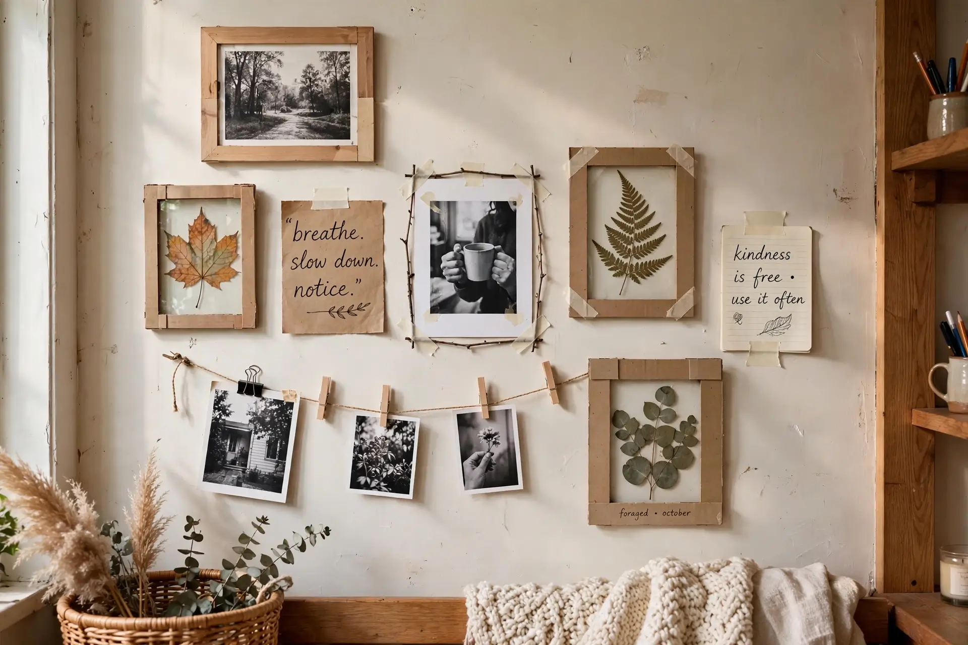
The $0 Gallery
Your phone is full of art you haven't printed yet. Your walks are full of leaves worth pressing. Your handwriting is a font nobody else has. The $0 gallery turns what you already own into a wall that looks deeply personal — and personal is the one thing money can't buy. Start here even if your budget is bigger: a wall with your own story on it anchors a room emotionally, and then any purchased pieces become supporting actors instead of strangers. The best "expensive" walls in the world have this layer — the personal artifacts that make guests lean in closer.
How to do it
- Print 6–9 photos in black and white — B&W unifies any set of photos instantly, hiding clashing colors. Home printer or a cheap print shop both work.
- Add nature — pressed leaves or flowers between book pages for a week, then into simple frames or even taped with washi.
- One handwritten piece — a favorite quote in your own handwriting, large on plain paper. It's the most "expensive-looking" piece because it's one of one.
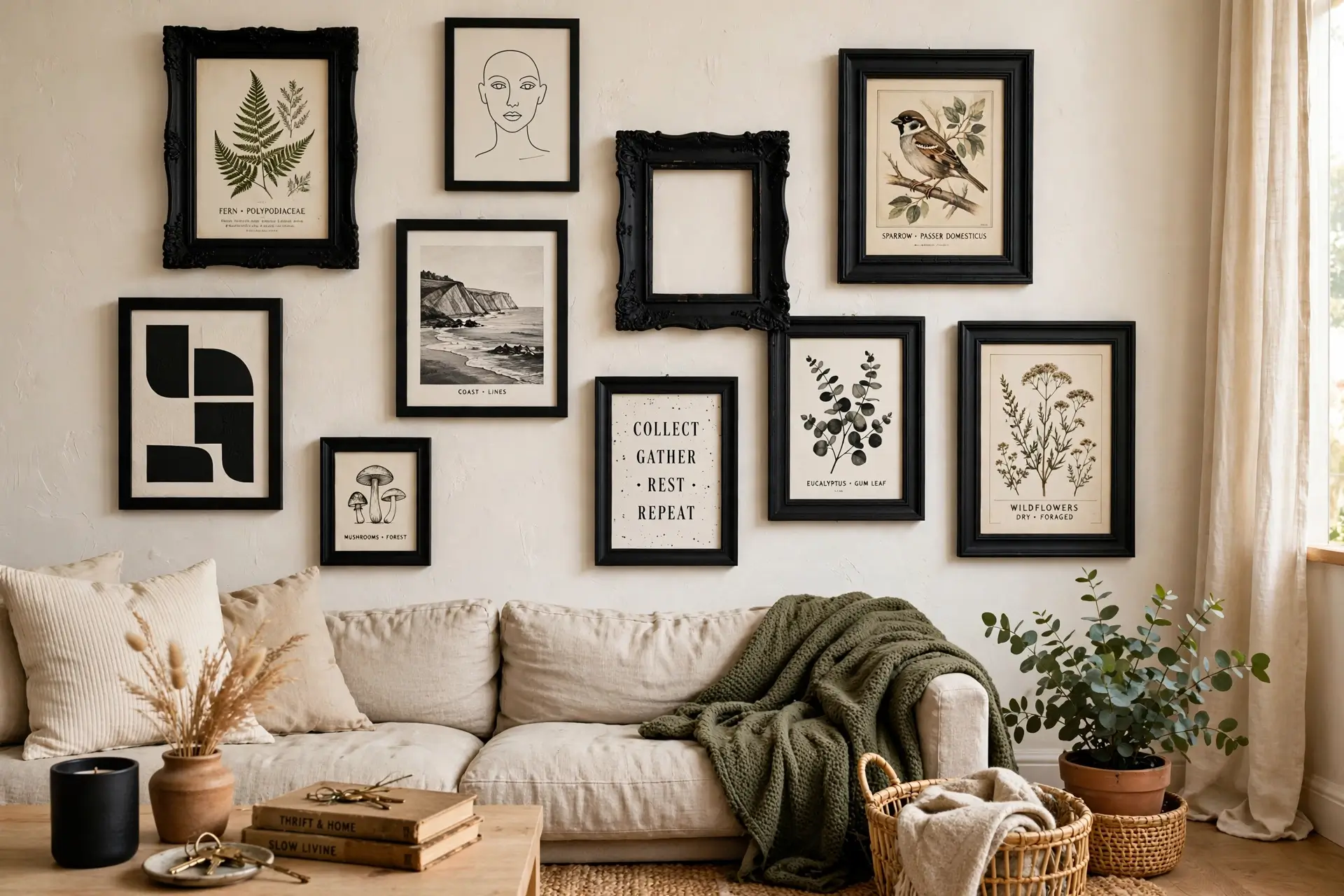
The Thrift Flip
Thrift stores are full of frames with great bones and terrible finishes. One can of spray paint erases every mismatch: ten different frames become one intentional set. This is the highest style-per-dollar move in all of wall decor — the "before" is embarrassing, the "after" is unrecognizable. Pro tip: shop the frames with the ugliest art, because nobody else wants them and they're priced to move. Ornate gold frames from the 90s become stunning in matte black; chipped white wood becomes fresh in satin white. You're not buying frames — you're buying shapes, and paint does the rest.
How to do it
- Buy ugly frames cheap — ignore the color and the art inside; check only size, shape variety, and solid construction.
- One can of spray paint — matte black is foolproof, matte white is airy, gold is glamorous. Paint everything the same.
- Fill with free art — your $0 gallery prints, free museum printables, or pages from old books and calendars.
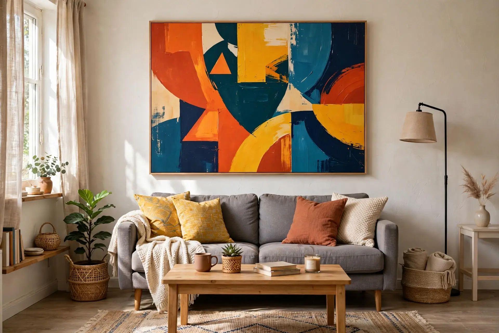
The One Big Move
Designers know a secret: one large piece beats ten small ones. A single oversized canvas — even an affordable print — anchors a whole wall and makes the room feel finished in a way clusters sometimes can't. This is your one smart splurge: put the entire budget into scale, not into "fanciness." Small art on a big wall looks like an apology; big art looks like a decision. If you've ever wondered why hotel lobbies feel luxurious, it's this — one confident piece at the right scale, doing all the work while everything else stays quiet.
How to do it
- Go big or go home — the piece should span roughly two-thirds the width of the furniture below it. Too-small art is the #1 budget-wall mistake.
- Abstract is your friend — large abstract prints look expensive at any price because there's no "cheap" reference point. Avoid cheap-looking photo prints of famous places.
- Hang it right — center about 57 inches from the floor (gallery standard), or 6–8 inches above the sofa. Right height is free and changes everything.
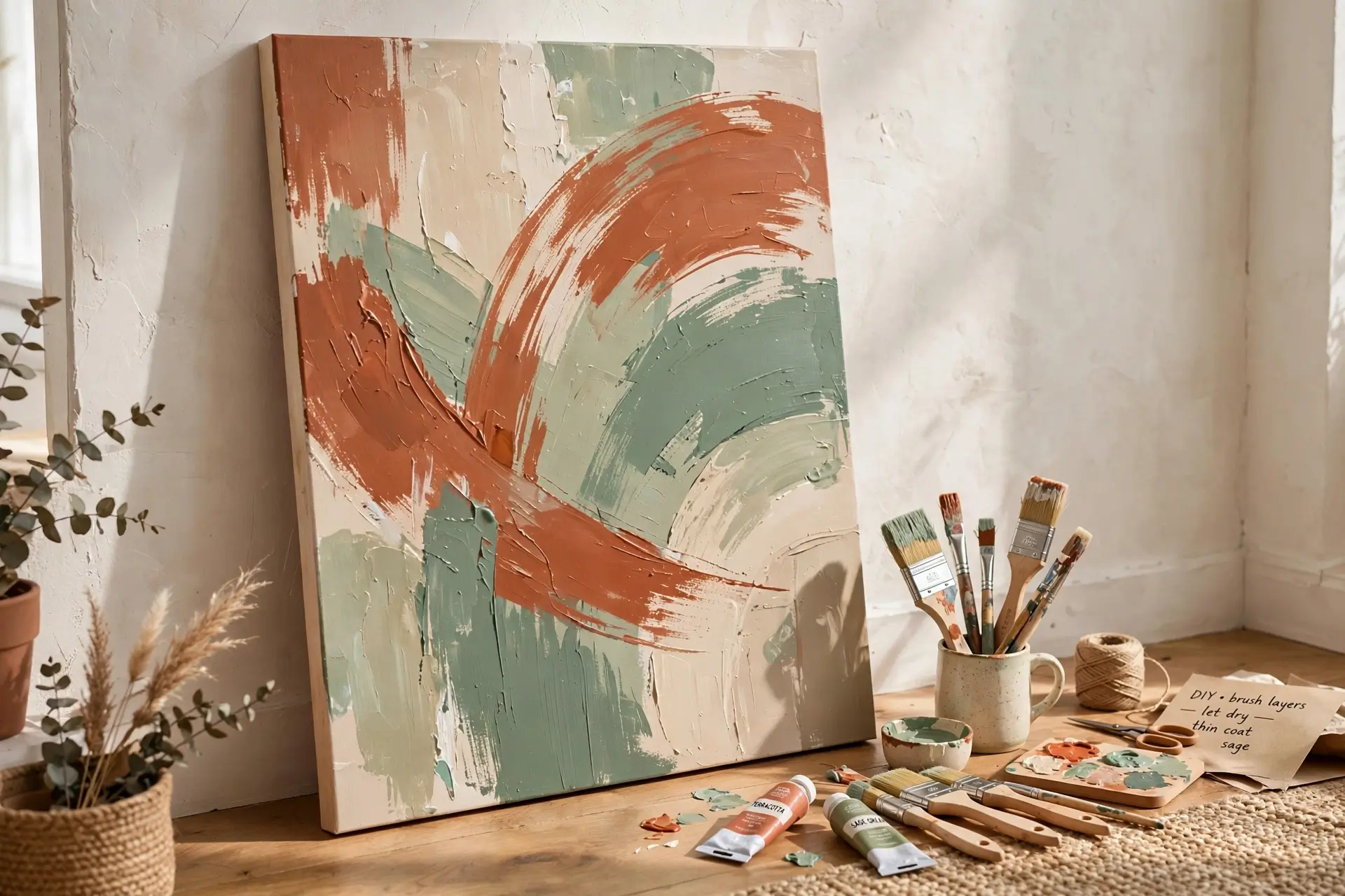
The DIY Canvas
A blank canvas, three tubes of acrylic paint, and an afternoon. Abstract brushstrokes in your room's colors — terracotta, sage, cream — become original art that matches your space perfectly, because you mixed the colors from it. Nobody can buy this in a store, which is exactly why it looks like it cost a fortune. And here's the part nobody admits: abstract art is genuinely hard to mess up. The "mistakes" — drips, uneven edges, unexpected mixes — are what make it look hand-made and human instead of mass-produced. Perfection is the enemy; character is the goal.
How to do it
- Steal your palette — pick 3 colors already in your room (cushion, rug, throw). Instant harmony, zero color-theory stress.
- Big brushes, bold moves — large brushstrokes and plenty of negative space look modern; fussy details look amateur. Less is more.
- Step back often — judge it from across the room, where it'll actually be seen. Up close every DIY looks rough; from the sofa it looks like art.
🛋️ The $50 Weekend Wall Plan
One weekend, one wall, about fifty dollars — and a transformation you'll photograph. Here's the exact sequence:
- Saturday morning: thrift store run — grab 6–8 frames in varied sizes, ignoring their colors completely ($15–20).
- Saturday afternoon: spray-paint them all matte black; print your photos in B&W while paint dries.
- Sunday morning: lay the arrangement on the floor first — trace, shuffle, photograph it.
- Sunday afternoon: hang using paper templates taped to the wall — no measuring regrets. Step back. Admire your "expensive" gallery wall.
Budget Wall Mistakes
Too small, too high
Tiny art floating near the ceiling looks lost and cheap. Fix: center at ~57" from the floor, 6–8" above furniture. Scale + height are free.
Every frame a different color
Rainbow frames scream "leftover," not "collected." Fix: unify with one paint color — the thrift flip (Rung 2).
Fake-famous art
Cheap prints of the Eiffel Tower or "Live Laugh Love" in script font. Fix: your own photos, abstracts, or nature — personal beats generic always.
Ignoring the renter rules
Nails everywhere in a rental = deposit goodbye. Fix: adhesive strips rated for the frame weight, or lean large pieces on furniture. Check manufacturer instructions.
Lighting: The Free Luxury
The cheapest way to make any wall look expensive costs nothing: light it properly. Art in a dark corner looks sad at any price; the same piece catching daylight or a warm picture light looks gallery-worthy. If your wall gets natural light, hang your best pieces where the light lands. In the evening, a single warm spotlight — even a cheap clip light — aimed at your gallery wall creates the museum effect: suddenly it's not "some frames," it's an exhibition — your living room becomes a gallery after dark. Designers spend thousands on art lighting because it works; you can get 80% of the effect by simply paying attention to where light already falls in your room.
🚪 The Guest Test
You'll know your budget wall works when a guest asks where you got a piece — and you get to choose your answer. Watch for the lean-in: when someone steps closer to look at your wall instead of glancing past it, you've won. It means:
- "Thrift store, $3" — said with pride, because the flip is invisible.
- "I made it" — the ultimate flex, and completely true.
- They never ask about price — they just say "your place looks amazing." That's the real win: the wall reads as styled, and styled has no price tag.
Budget Wall Decor FAQs
How can I decorate my walls with no money?
Print your own photos in black and white, press leaves and flowers, handwrite a favorite quote large on paper, and rearrange what you already own. Uniform color (B&W) and even spacing make free items look curated.
Where can I find cheap wall art that doesn't look cheap?
Thrift stores for frames (unify with spray paint), free museum printable collections online, and your own photo prints. Abstract prints in large sizes also look expensive at low prices — avoid small generic photo prints.
How do I make a gallery wall look cohesive on a budget?
Pick one unifying rule: same frame color, same subject matter, or same palette (like all black-and-white). Consistent spacing between frames matters as much as the art itself — use 2–3 inches apart as a starting point.
What is the cheapest way to fill a large blank wall?
One oversized piece beats many small ones — a large canvas or DIY painted art fills the space with a single purchase. Alternatively, a floor-planned gallery of thrifted frames covers big walls for very little.
Can I hang wall decor in a rental without damage?
Yes — use adhesive hanging strips rated for your frame's weight, lean large art on furniture or mantels, or use freestanding displays. Always check the manufacturer's weight limits and your lease terms first.
Is DIY wall art actually worth it?
For abstracts, absolutely — big brushes, three colors from your room, and plenty of negative space produce genuinely good-looking pieces. It also matches your space perfectly since you mixed the palette from it.
Keep exploring: the wall ideas collection has more for every budget, plus living room ideas and bedroom ideas to style the rooms around your new walls. Or start from the Roomiora homepage — your beautiful walls are waiting.
Malik Ashraf
Founder & Editor, Roomiora. Home-design enthusiast sharing real-life room ideas — tested layouts, honest costs, no showroom fantasies.
More about Malik →