Blue Kitchen Ideas: Find the Shade That Makes Your Kitchen Sing
Blue is the world's most-loved kitchen color — and the easiest to get wrong. Four shades, four distinct moods, one perfect match for your light, your space, and your nerve.
 By Malik Ashraf · 12 min read
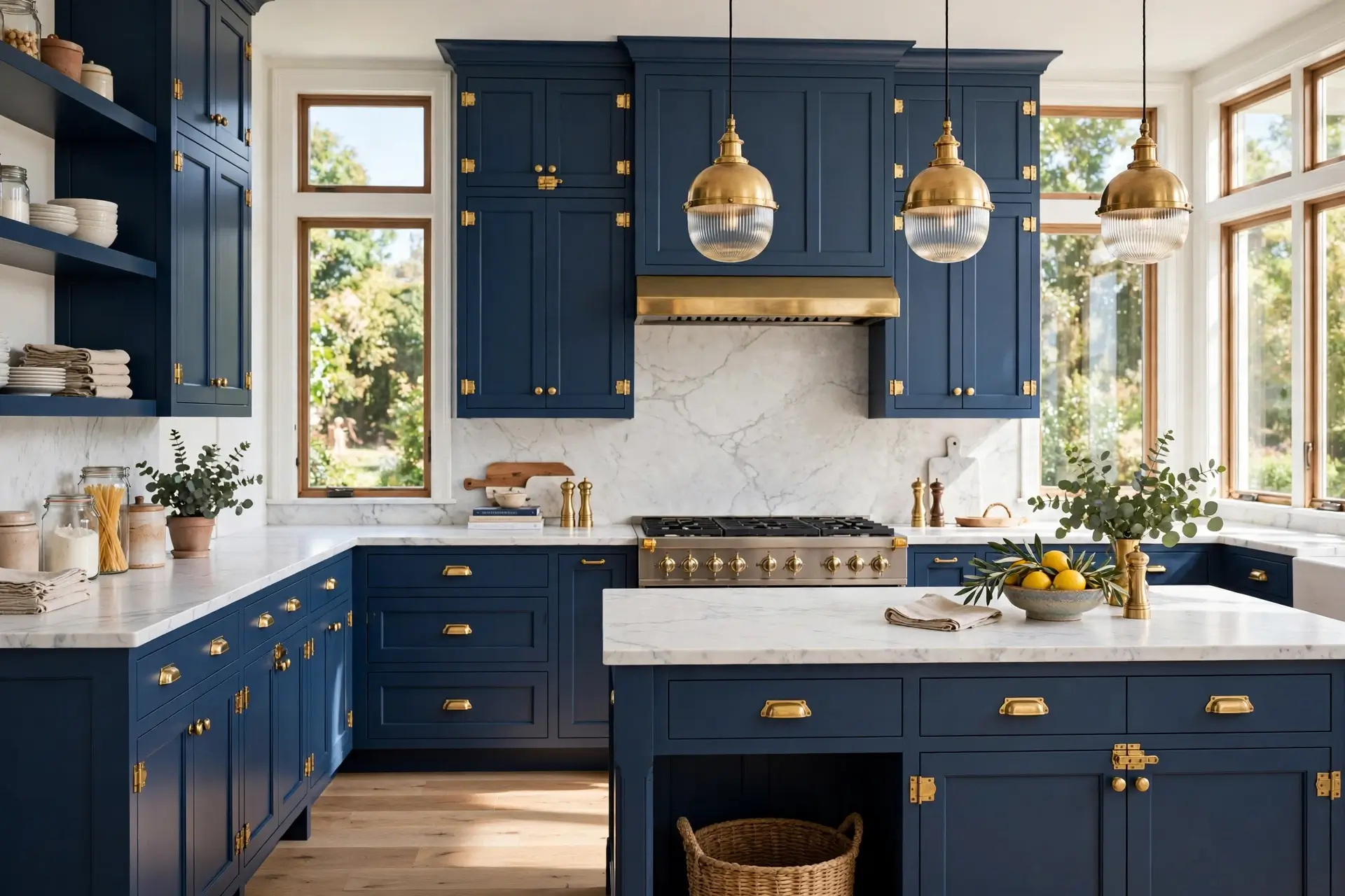 💙 4 SHADES · 1 PERFECT MATCH
Blue kitchens are everywhere right now — and no wonder. Blue is calming like nature, classic like a white shirt, and somehow both bold and safe at once. But here's the thing nobody mentions: "blue kitchen" means almost nothing until you pick the shade. Powder blue and midnight blue are as different as linen and leather. Choose with your light and your space in mind, and blue does magical things. Choose blindly, and you get a kitchen that fights you every morning.
This guide walks the spectrum from palest powder to inkiest midnight — four shades, each with its reference photo, its mood, its perfect pairings, and its warnings. By the end, you won't just have a favorite blue; you'll know exactly where it goes, what it pairs with, and what to avoid. Find yours below, or take the 30-second shortcut first.
Why Blue Works: The 60-Second Psychology
Blue is the world's favorite color — study after study puts it at the top across cultures and age groups. In a kitchen, that popularity translates into something practical: blue feels simultaneously calm and clean. Cool colors recede visually, which is why blue walls and cabinets can make a kitchen feel slightly larger. Blue also suppresses appetite less than you'd fear and stimulates conversation more than you'd expect — it's the color of dinner parties that run long.
There's a deeper reason blue dominates kitchen design right now: it's the rare color that's both a neutral and a statement. Navy behaves like a neutral — it goes with everything. Teal behaves like a personality — it is the design. Powder behaves like a whisper. One color family, four completely different kitchens. That's why this guide is organized by shade, not by style: pick the shade first, and the style follows.
The 30-Second Shade Finder
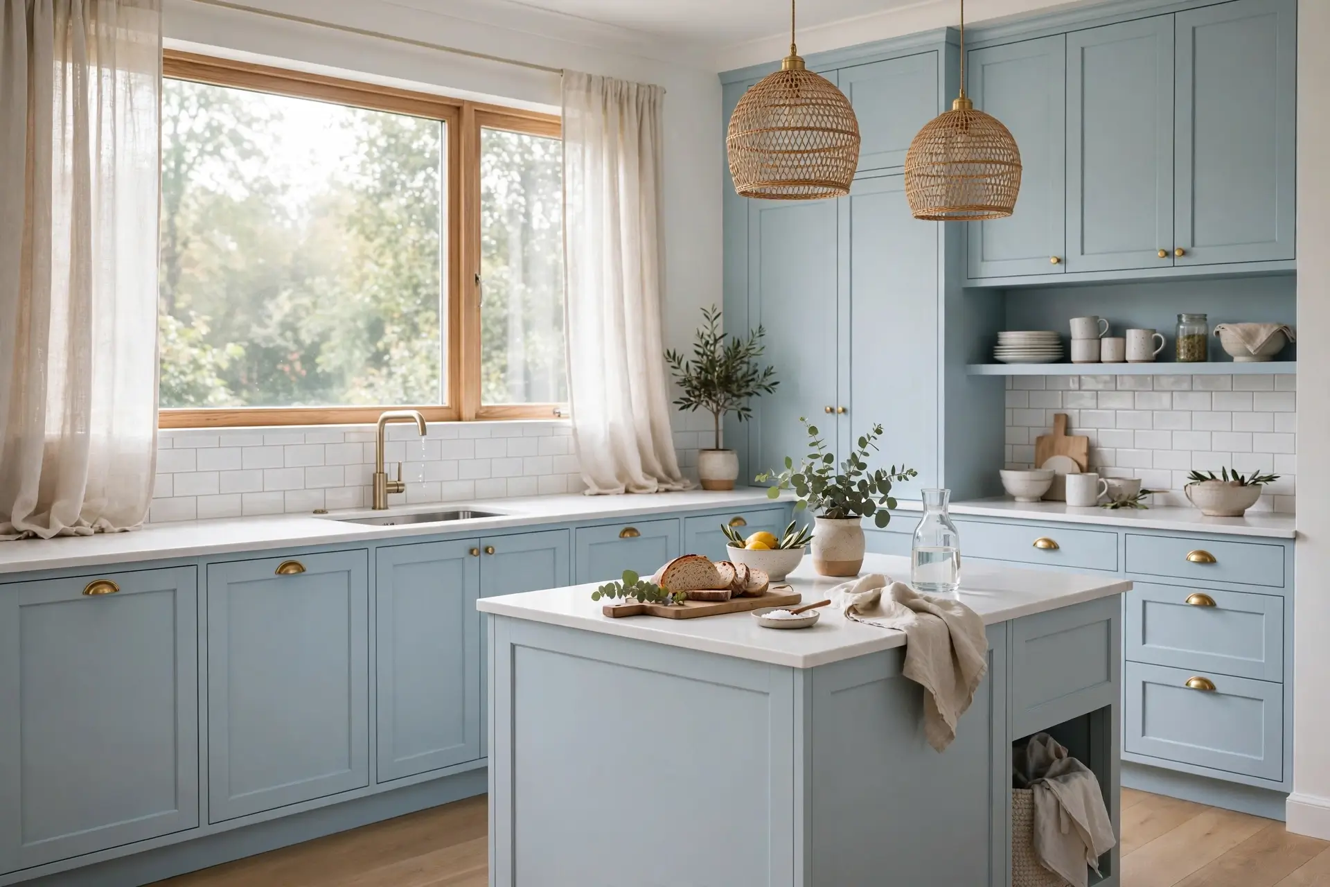
Powder Blue: The Small-Kitchen Whisper
Powder blue is blue at its gentlest — barely-there, like sky through morning mist. In a small or north-facing kitchen, it does something remarkable: it adds color without stealing light. Walls seem to recede, the room breathes, and you get all the calm of blue with none of the visual weight. It's the shade for people who want color but fear commitment — soft enough to live with for a decade, pretty enough to photograph beautifully. Powder blue also plays beautifully with vintage and cottage styles: it has a nostalgic softness that deeper blues don't, like a kitchen from a childhood memory, updated.
⚠ Watch out: in very dim kitchens powder blue can read as grey. Test a sample in your actual light before committing.
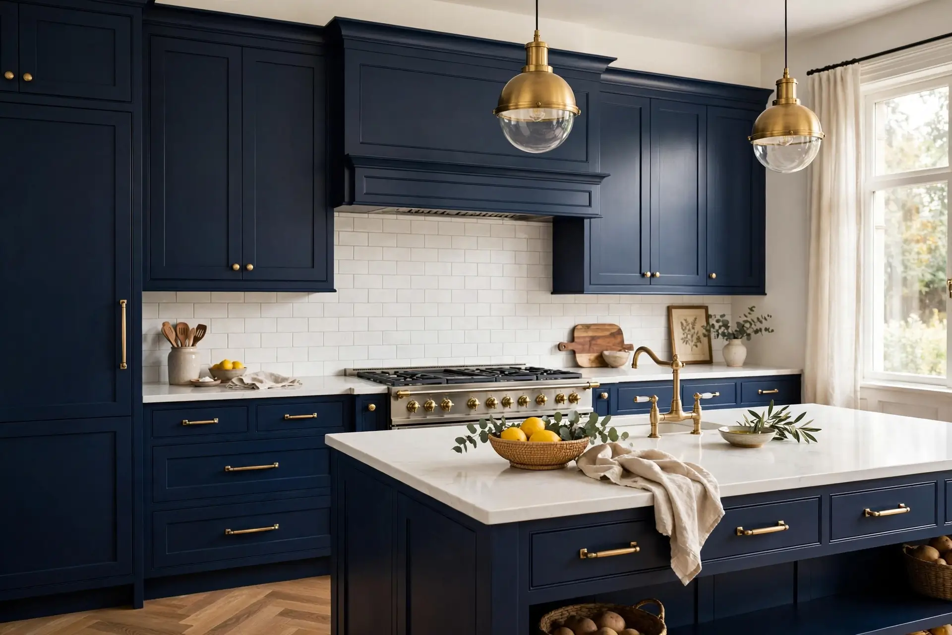
Classic Navy: The One That Never Dates
Navy is the blue equivalent of a tailored suit — it has never been out of style and likely never will be. On shaker cabinets with brass hardware and marble-look counters, it's the most requested kitchen look of the last decade for good reason: it grounds a room, hides everyday wear gracefully, and pairs with everything from farmhouse to ultra-modern. If you can only pick one blue for the rest of your life, pick navy and don't look back. Navy also has a secret superpower: it's dark enough to feel dramatic but familiar enough to feel safe, which makes it the easiest "bold" choice in all of kitchen design — maximum impact, minimum risk.
⚠ Watch out: navy needs light to show its depth — under-cabinet LEDs and good daylight keep it rich instead of murky.
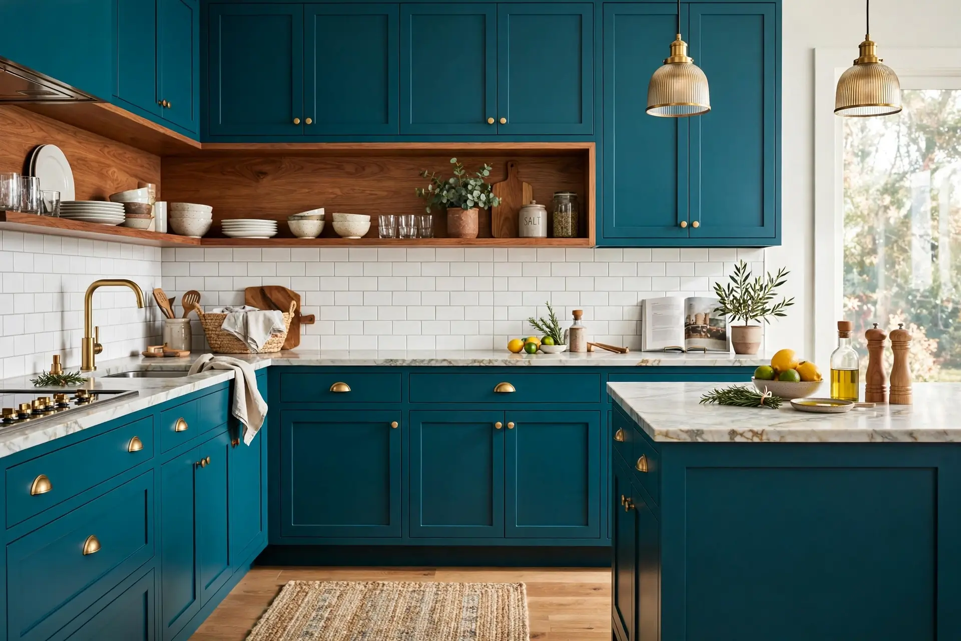
Teal: The Personality Pick
Teal sits exactly between blue and green, and it brings the energy of both — the calm of blue, the life of green. It's the shade for kitchens with personality: it loves warm wood, rattan, plants, and handmade tiles. A teal kitchen never feels generic; it feels collected, like somewhere interesting people cook interesting food. If navy is the tailored suit, teal is the vintage jacket — same quality, much more story. Teal is also remarkably forgiving in real life: its green undertone hides cooking splashes and daily wear better than purer blues, and it looks good in both warm and cool lighting, which makes it a practical pick for kitchens used hard every day.
⚠ Watch out: teal shifts with light — it can read greener by day, bluer by night. Live with a sample for a few days before deciding.
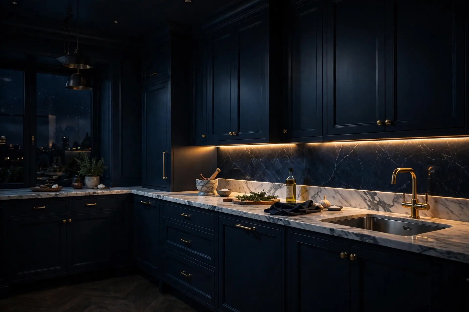
Midnight: The Brave, Beautiful Dark
Midnight blue — so deep it's almost black — is the most dramatic move on this list, and the most misunderstood. Used everywhere it can shrink a room; used with intention (lower cabinets only, or one wall, or a butler's pantry) it creates a cocooning, jewel-box effect that lighter shades can't touch. It makes brass glow, marble pop, and evening lighting feel cinematic. This is the shade for people who'd rather have a kitchen with atmosphere than a kitchen with square-footage bragging rights. And here's the insider trick: midnight is actually the most forgiving dark shade — unlike pure black, its blue undertone keeps it feeling rich and alive rather than flat, especially under warm light.
⚠ Watch out: midnight shows dust and fingerprints more than lighter shades. Matte finishes hide them better than gloss.
🎨 3 Pairing Rules for Any Blue
- One blue, one metal, one wood. Blue + brass + oak is a complete palette. Every extra finish you add dilutes the calm that made you choose blue.
- Light the blue you chose. Every shade on this list looks richer under warm, layered light and flatter under a single cold bulb. Light is the difference between "paint color" and "atmosphere."
- Balance the temperature. Cool blues love warm partners — wood, brass, warm white light. An all-cool blue kitchen (grey floors, chrome, daylight bulbs) can feel chilly no matter how pretty the shade.
The Two-Tone Trick: Have It Both Ways
Can't decide between shades — or between blue and not-blue? The two-tone kitchen is your answer, and it's one of the smartest moves in modern design. The classic formula: blue below, light above. Navy or midnight lower cabinets grounded and dramatic, with white or pale uppers keeping the room airy. You get the depth and personality of blue exactly where the eye rests, and the brightness of white where the room needs lift.
Two-tone also solves the commitment problem: painting just the island in your chosen blue is a weekend project, not a renovation, and it delivers the vast majority of the blue-kitchen feeling. If you love it, expand to the lowers later. If not, one weekend repaints it back. Other winning pairs: teal island with white perimeter, midnight pantry wall with oak shelving, powder-blue uppers with white lowers for a barely-there coastal feel. The rule is simple — one blue, one quiet partner, and the blue always gets the starring role.
Blue Beyond Cabinets: 5 Smaller Ways In
Not ready to paint the cabinets? Blue works in smaller doses too — and these are renter-friendly. A blue range cooker or retro fridge becomes the kitchen's jewelry. Blue zellige backsplash tiles add handmade shimmer behind the counter. Open shelves styled with blue ceramics give you the color in objects, not commitments. A blue runner rug warms up the floor and can be rolled away. And painting just the island in navy or teal — the classic two-tone move — delivers 80% of the blue-kitchen feeling with 20% of the commitment.
Blue Kitchen Mistakes
Choosing from a phone screen
Blue shifts more than any color between screen, store, and your kitchen. Fix: always test a real sample pot on the actual cabinet, in daylight and lamplight.
Blue everything, everywhere
Blue cabinets + blue tile + blue walls isn't coastal, it's underwater. Fix: one blue moment per sightline — cabinets or island or backsplash.
Ignoring the undertone
Blues hide green, purple, or grey undertones that clash with your floors and counters. Fix: hold the sample against your countertop and floor — undertones reveal themselves in comparison.
Forgetting the ceiling
A dark blue kitchen with a dingy ceiling feels like a cave. Fix: crisp white ceiling and good lighting — the "air above" rule, especially for navy and midnight.
🖌️ The Sample Pot Test
Before you commit to any shade, run this weekend test:
- Paint a large sample board (not the wall — a board you can move).
- Prop it against your cabinets in morning, noon, and evening light.
- Hold it next to your countertop, floor, and hardware finish.
- Live with it for 48 hours. The shade you stop noticing — the one that just feels right — is your blue.
Blue Kitchen FAQs
Q1.What is the most popular blue for kitchens?
Classic navy remains the most popular — timeless, versatile, and forgiving. Powder blue suits small kitchens, teal suits characterful ones, and midnight suits the brave. Navy is the safe answer; the others are the personal ones.
Q2.Do blue kitchens go out of style?
Navy and powder blue have been kitchen staples for decades and show no sign of leaving. Very trendy teals may feel dated sooner — if longevity matters most, lean navy or powder.
Q3.What color goes best with blue kitchen cabinets?
White and pale stone counters are the classic partners; brass or gold hardware warms blue beautifully; natural wood floors keep it from feeling cold. The golden trio: blue + brass + oak.
Q4.Is a dark blue kitchen a bad idea in a small space?
Not necessarily — but use it strategically: lower cabinets or one wall only, with light uppers, pale counters, and strong lighting. All-over midnight in a tiny dark kitchen will feel smaller; as an accent, it's stunning.
Q5.Should kitchen walls match blue cabinets?
Usually not — matching walls and cabinets in the same blue flattens the room. Let the cabinets be the blue moment and keep walls warm white or a very pale tint, so the blue has something to stand out against.
Q6.How do I choose between navy and teal?
Ask what feeling you want: navy is tailored and timeless; teal is lively and characterful. Navy pairs with marble and brass; teal pairs with wood and handmade tile. When in doubt, sample both — the right one feels obvious in your light.
Keep exploring: the full kitchen ideas collection keeps growing, plus wall ideas for kitchen walls and living room ideas for open-plan spaces. Start from the Roomiora homepage if you're new here — and whatever shade you choose, trust the sample pot over the screen. Your kitchen's light gets the final vote, always.
Malik Ashraf
Founder & Editor, Roomiora. Home-design enthusiast sharing real-life room ideas — tested layouts, honest costs, no showroom fantasies.
More about Malik →